Bamburgh - 6x12 Bitmap Font
A downloadable font
BAMBURGH is the system font of the Adventuron text adventure development game engine.
The font is 6 pixels wide by 12 pixels tall and supports Spanish / French and Italian accent characters.
Originally created in 2019 to accompany the remake of Excalibur in both English and Spanish without looking squashed, whilst retaining "retro" feel.
Best used in 12 pixel vertical increments to avoid scaling artifacts.
Licensed under the SIL Open Font License, in ttf form, so that it may be used elsewhere.
Details
- Font Name: Bamburgh
- Author : Chris Ainsley.
- License : SIL Open Font License (Attribution required)
- Date of Creation: Jan 2019
- Date of Release: 23/03/2020
Sample Screenshots
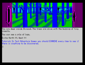
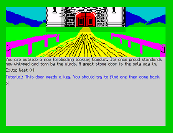
- The Curse of Rabenstein by Stefan Vogt (mockup).
- Excalibur: Sword of Kings by Ian Smith / Shaun McClure. Adventuron version by Chris Ainsley.
- Over Here! by Aureas.
Contact
- If you like this font, please take the time to check out Adventuron, and follow on Twitter.
Changelog
- 2020/04/?? - Updated to 1.0.1 - Added French glyph support.
- 2020/04/23 - Updated to 1.0.2 - fixed lower case i accents.
- 2020/08/18 - Updated to 1.0.3 - Fixed height of lower case i accents (for real this time).
| Status | Released |
| Category | Assets |
| Author | Adventuron |
| Tags | Fonts |
| Content | No generative AI was used |
Download
Download
Bamburgh-Font-1.0.3.zip 7.7 kB


Comments
Log in with itch.io to leave a comment.
Nice, but not really compatible with the French language as you say.
French accent characters:
à â ç é è ê ë î ï ô ù û œ æ
À Â Ç É È Ê Ë Î Ï Ô Ù Û Œ Æ
« » … €
Uncommon (for words in Old French or borrowed from other languages):
ä ü ö ÿ Ä Ü Ö Ÿ
Hi,
Sorry.
Please check out 1.0.1.
Chris
Thank you.
It may be soon possible to create games in French (or other languages) with the verb-noun version of Adventuron, such as the treasure hunt style (a version without adjectives and prepositions greatly simplifies the use in other languages).
Is there a possibility to redefine the directions of the compass: north, south, east, etc.? (This seems to have been done for the Spanish version of TWO).
Hi Yes.
I think I'll put together a French version of Adventuron. Should be less effort now that Spanish is done and the standard font should (mostly) be working for French.
Watch this space.
There is a small problem with the graphics of the 'ï' and the 'î': you have left the accent lower, which makes three dots instead of two.
Please check out 1.0.2.